 If you've ever wondered how many websites exist, the truth is frightening: as of 2018, there are so many registered domains, sites and landing pages that it's impossible to know how many there really are. Furthermore, at least 3 million blog posts are published every day and Google logs about 3.5 billion searches every 24 hours.
In short, there's a lot of traffic to a lot of places. As a result, it's not surprising that most of your website visitors will leave within fifteen seconds of arriving.
That's a pretty brief window to make an impression and stand out from the noise. The best content marketers therefore pay attention to the principles of good web design to keep visitors longer, ensure they are engaged, and draw them to the most important areas of your site.
In this article, we will share five simple steps you can take to make sure that on your website, content and design are in harmony.
- Don't Bury Your Blog!
Whether it’s due to a difference in priorities between content and web design teams or whether it’s because content is an afterthought, companies often make their blogs difficult to find for first time users.
This is a big mistake. The point of a blog’s existence is to be read, and it will not be read if it is hidden somewhere far down on your website’s landing page or in your footer.
When comparing different site designs, Signal v. Noise once found that users dramatically prefer short landing pages to long ones. This is not surprising: web visitors won’t sort through mountains of copy to find the good stuff.

For this reason, it’s important to feature your blog prominently in a navigation menu that can be found no matter where a user ends up. According to heat maps, users love navbars and click on them frequently.
- Think in Terms of Heatmaps
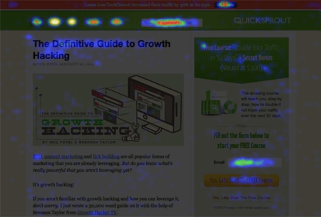
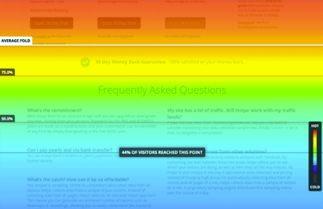
When it comes to web design, the most powerful tool at your disposal might very well be heatmapping which comes in three main forms: clickmapping, scrollmapping and mouse tracking.
A heatmap tracks the areas of your site where users pay the most attention which gives you an objective insight into the elements that stand out and what’s fading into the background.

Since it’s been around a long time, a few key insights have emerged over the years which you should know about:
- People don’t read websites like books. They scan up and down.
- People spend significantly more time reading when images are included – 94% more, according to one study
- Every site has an ideal content length, and most content marketers skimp here. Readers love long content, and 1,900 words turned out to be the most popular length in an analysis of one million Google searches
A site should be assessed according to these general rules first, and then tweaked to fit its audience. Investigate options that integrate mapping into your content strategy - Crazyegg’s Scrollmap is a great start.
- Use Consistent Branding
As the center of a brand’s web presence, a website is central to forming a brand’s image and expressing their identity. For this reason, the way that content is written and presented should constantly remind readers that they are on your website and not somewhere else.
This translates to a few dos and don’ts:
- Don’t publish content that seems “off”. If your brand isn’t “funny,” don’t be “funny.” If your brand isn’t “techy,” don’t publish “techy” stuff.
- Don’t stray from your main focus or get sidetracked by news items, concerns or industries that don’t represent your core values or goals
- Do establish visual parity between your blog’s images and your branding: this extends to logo color palette, stylization, fonts, backgrounds, etc.
- Do develop a “voice” that goes well with your product or industry. For instance, a law firm should adopt a cold, professional voice while a pet shelter should use something more warm and inviting.
In general, you’ll know your blog is “off” if it feels like a different website from your main site. This is understandable since many businesses develop a site separately from their blog and use different software to host them both; nevertheless, work hard to ensure consistency between them both.
- Follow the KISS Principle
You probably know what KISS is: Keep it Simple, Stupid. It applies to a website in general, and especially to content because the evidence shows web users are appalled by complexity. According to one study, people are rarely able to think about more than four things at a time:
The human brain is not optimized for the abstract thinking and data memorization that websites often demand. Many usability guidelines are dictated by cognitive limitations.
At a minimum, this means three things:
- Reduce visual distractions as much as possible. Avoid flashy or convoluted buttons, any non-neutral backgrounds and ensure that few items are presented to the reader at any given time.
- Do not display ads to your readers. If you are following a content marketing strategy, that means the content is not your final product and ad-revenue is not an important part of your business strategy.
- Think like Gordon Ramsay. When he finds a restaurant menu with too many items, he produces a new one with much fewer options. While visitors like variety, they can also enter “analysis paralysis” when a blog spans too many topics in too many posts.
Not only will decluttering keep your visitors more engaged, it will also reduce your workload and enable your brand to focus on what it does best.
- Format for Casual Reading
Occasionally brands develop serious, long-form content like whitepapers, case studies or peer-reviewed market research. That’s a good thing – but it’s not the norm, nor should it be.
Ideally, content marketing turns casual visitors into dedicated readers who eventually become paying customers. This won’t happen if you make your blog a pain to read, either by treating every post like a master’s thesis, or by using terrible formatting decisions.
Good formatting can drastically reduce your bounce rate. Since Internet users scan, their eyes glaze when confronted by long or convoluted paragraphs. Web-content should be written to retain attention and interest.
Here are a few ways to do that:
- Use short paragraphs so if readers skip a few, they still get the point. There is actually a science to this - Yoast has an algorithm for ideal paragraph lengths, and a free WordPress plugin to warn you when you’re bloviating.
- Use bullet-points like these to relay important information, increase persuasiveness and give those paragraph dodgers something to chew on.
- Use block quotations that highlight a particularly important phrase or distinguish someone else’s words from your own. Formatted quotations can quickly boost authority and disrupt a monotonous wall of text.
- Use basic principles of rhetoric: all good content makes an argument. Learn the difference between Logos (logic), Pathos (emotion) and Ethos (credibility) and use them every step of the way to prove a point. When a blog post is written this way, the format will reflect it, and readers will naturally absorb more information by scanning than they would otherwise.
Conveyance Marketing Group is a team of bright, innovative and talented veteran marketers dedicated to big ideas, fresh insights and measurable results. We pride ourselves on taking challenging marketing issues and turning them into opportunities for our clients, on pointing brands in the right direction, and on getting our customers noticed both online and off. From branding to websites to digital marketing, and public relations, we handle all your marketing communication needs! Web Design and Development | Brand Strategy | Inbound Marketing | Social Media | SEO | PR

